
EXHIBITION VISIT
CHATTER AT LOYOLA UNIVERSITY, MARYLAND
September 21 – October 22, 2017

Can you talk about the title of the show, Chatter?
The title came from my visual experience of driving alongside cornfields when I was living in Illinois. When you drive alongside the rows, your eyes chatter, trying to focus on the individual corn stakes–your eyes struggle to focus and the field begins to move forward and backward like when you slow film down and see it frame by frame. I’m really interested in the subconscious state when your eyes relax and this visual effect happens. The middle piece “Knee High by the 4th of July,” is the anchor to this project. My intention is that no matter how you move around the exhibition, you always see the other work through this piece. When I was offered this exhibition a year ago, it was my goal to convey a visual play between the objects. After finishing my first Hamiltonian focus show in March, I instantly jumped into designing how I wanted to elicit and convey that idea of a cornfield and require that everything in the exhibition have a direct interaction.

You have 2D work in this show, which is new for you, why did you decide to include it here?
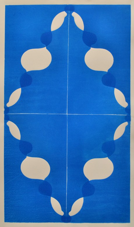
This exhibition was a great opportunity to take risks. I have been wanting to get out of my comfort zone. Full disclosure, this work is brand new and I am still very anxious and nervous about it, still figuring how to answer all my questions. I’ve always been interested in making 2D work, even more since I started working at the Baltimore Museum of Art as a conservation technician. At my job, I’m am constantly caring for works on paper–while framing and matting the works from the collection, I have had time to study the printmaking processes. I’m able to see how they’re made, take the time and see the embossings, the paper texture, and really study everything from Classical French etchings to contemporary heavy woodblocks. There’s something in this process that’s very similar to my background in ceramics; it’s very process-laden. You have to set up everything from mixing the ink to making sure you have everything registered in the jig. So working two-dimensionally came very naturally and it was nice to see something actualized that I have talked about for a long time. As something that started maybe two years in discussion, it never really got off the ground for many reasons–it just wasn’t a high priority, but with this exhibition I really wanted to put forth the effort to display these. And working with printer Jessi Hardesty, we did a trade: she used my shop for her work with the promise that we’d ink up some of these patterns that I use for sculptural pieces. The shapes are called corbels and the ones used in these prints are either traced from my pictures or are from real architectural pieces.


It’s still a manual process: I start by cutting them out with the jigsaw, sanding and shaping them, for the most part by hand. I then start using a router table to create exact multiples from the master pattern. It really struck me that I wanted to do printmaking when one day I made maybe 15 or 16 and stacked them as they were completed. As I was stacking them, they began to off-set, and that’s when I noticed something really visually interesting was working, I can’t speak to the time of it, but when looking at these prints and their patterns I began to see a relation to a Polly Apfelbaum print or how Jacob Hashimoto uses the same object in repetition–thinking about using different pieces and parts and to make a larger image. The sum is greater than the parts and the parts are greater than the sum. The first print in the exhibition, is a translucent blue over blue. When we were playing with inks and after the first test print was pulled, I was instantly attracted to the blue. I love how it read almost immediately as an architectural blueprint.
I love architecture, I love space, I think that’s why I’m a sculptor. I enjoy the intertwined relationships of objects, humans, and space, all playing together, pushing and pulling, directing or guiding you on how to move through, around, to and from.

While printing, we started playing with the translucency and different colors. We stuck to a primary palette of red, blue, and yellow. The overlaps are great because they’re secondary colors of orange and green in this case. I really enjoy when you can recognize one object, but then the object behind or above it changes it. And then there’s a chatter. Two images overlapping each other, creating a third image. What is your eye supposed to focus on–foreground, middle ground, or background? Your brain, in that state, is trying to to give an answer for what’s ahead of it. For me, that’s really intriguing about this 2D work in that it directly influences the 3D work and vice versa. I think they’re playing really well together.

Can you talk about the different processes you use for this work specifically?
When I began making the “master” object for the geometric corn stalks, ceramic materials and processes were not conducive to give me the results I wanted, so I started looking around and I reached out to a few people–one specifically, Magali Hebert Huot, who is the urethane rubber queen, and she suggested using a Smooth-On product called Brushable 40. This is a 2 part brushable urethane rubber and that allowed me to cast in plaster, which is a more immediate process. I made a wooden master out of a Douglas Fir clean pine board that I ripped down into 1in x 1in squares. Each side is composed of 12 equilateral triangles that slot together. I chose to do the slot together so that everything can be flat-packed. Part of my process, and maybe the working in a museum has made me appreciate, when an artist goes that extra step to pack and prepare their artwork. There were definitely some bumps in the road during the plaster casting, one being I’m used to using this plaster in particular way for making molds that when you pour it you want it a little bit thicker. With all these very tight holes and details, it lent to a lot of air bubbles. I wasn’t too concerned with the little bubbles because it’s just part of the process. From a distance everything looks the same; when you get up close, each individual piece has its own characteristic

There’s only so much I can fit in my car. Hindsight is 20/20 and early on when I moved to Baltimore I had a solo show in Arlington. I made the mistake to assemble everything almost complete in my studio and subsequently I had to make what I remember as seven trips because I was so bad about being able to break these things down. Everything had to be fixed. There were a couple throwaways. There were always some that would be hiccups–you think you pour them in right and the side would blow out and you’d just have to throw it away. Those parts are floating around the studio; they’re great for later information. Ultimately, once I found the technique and the timing and everything was right, it was actually really quick. There’s 36 [pieces] from the two rubber moulds. I can make one every hour and a half with the curing process.

I always go back to that playfulness and lightheartedness. I think it’s a great way to engage the viewer and not scare the shit out of them. It’s not too minimal or too serious. We in the art world have to be able to engage a person that is straight off the street, and I believe it is good to think like that. It’s disrespectful not to take them into account. In the museum, you see a lot of the common man or woman, more so people that just have a general, basic knowledge. They might just know Picasso, Matisse, Degas, Renoir…but it’s great to see people out in that setting. And then in the Contemporary Art wing they’re all walking around like lost puppies. That element and theme of playfulness is important because it’s part of my process. I’m very light-hearted and loose in my studio, and I do these 3D drawings where I just take all these objects and various pieces and parts and I’ll just do these quick studies against a blank white wall. Five minutes, done, take a picture…and these are usually times when I’m feeling lost, anxious, or stuck.
How did you approach color or lack of color in this show?
The lack of color is something that is a breakaway from what’s comfortable. My calling card or MO when people see my work is the color. It’s very colorful, very clean. It has a certain playfulness that in a way began to feel repetitive or redundant. It was beginning to feel formulaic. I hate to think of my practice becoming formulaic, I don’t want to be that one trick pony.

I want this work to show it has flaws to it. There are imperfections. Some of the wood isn’t perfectly sanded. In the case of the “cornfield” piece in the gallery center, in the past I would have selected and cut down until I had selected the best 6 or 12 or 15 perfect pieces, not being able to sleep. It was a very honest and serious decision to just say, I want these materials and my process to show what they are, to be what they are. I threw it out there and so let’s see what happens.

What do you think you’re moving toward now that you’ve completed this work?
My new direction is both nervous and exciting, but I feel like this is the start of something larger. I think the seed has been planted. These are ideas and decisions I’ve been kicking around for at least 3 years and I believe up until now I went back to my “calling cards” because there was a certain level of apprehension related to my confidence when taking risks. I had to get to a point where I knew what I was going to be doing. You feel confident in your process. I like a good critique, but all those really good questions that come out of a “bad critique” informs decisions, and this move to make this new work pushed me in such a way that’s really exciting, and at the same time very nervous. I ran that race, finished that race, now I have some down time to rest and absorb and get feedback, and then I can charge forward and see where it goes.

Do you have anything else coming up, or exhibitions you’d like to promote?
This show goes until the Oct. 22nd, and then I’m working toward my second group show with Hamiltonian as part of the Fellows Converge show. We had a fellows retreat in August at the Wassaic Project where we met Will Hutnik and Eve Biddle, Will is the residency director and Eve is one of the co-directors of the Wassaic Project. Eve and Will are curating the show of new work from the 2015 and 2016 Hamiltonian Fellows. The show opens on Nov 18th, with a reception from 7 – 9pm. Finally, in late february, I have my final focus show as part of the Hamiltonian Fellowship. It’s a two person show with Patrick Harkin.
Purchase Kyle’s work to support UNCF here